
Let's enjoy some trends and examples of design blogs that are popular in this year.
Apparently the use of a minimalist layout, whitespace is quite broad, and typographic settings to be some important points in designing this blog. Some say, look directly would be better than just a word, so please enjoy.
Alonso
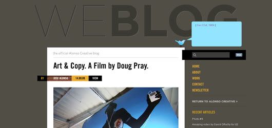
What's interesting about this blog design is a small element of the "hit" layout. As with the "by" tag and the search box on the right that passes through the content area.
The Design Cubicle
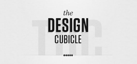
For those who had visited Brian Hoff's blog certainly not be forgotten by it archives style which located in the right sidebar. Besides the content areas that deliberately made smaller than the other blog also becomes a feature.
Christoph Zillgens
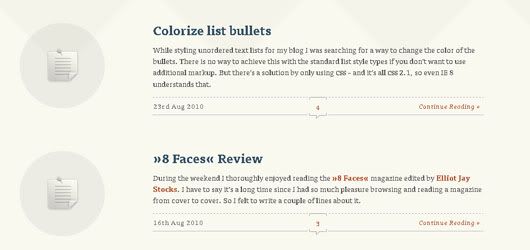
Icon placement on the left which represents the type of each post is quite unique. This type usually used in the Tumblr platform (standard). Details on the lines at each end of the post also gives a small details but cab brings a significant impact.
Fresh 01
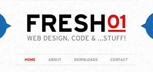
Wow! That's the word that comes out when I first saw this blog. The layout is quite normal, but if you've started scrolling, you will see a trick that makes me have liked the blog.
Jay Hollywood

Large images on the header of this blog has made quite easy to remember, despite the negative impact it is disturbing the main navigation above. This is one example of ordinary basic layout but can look good if the match with an interesting picture.
Morphix Blog
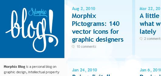
This blog design and illustration can prove that grid can collaborate to produce a Friendly designs (fun), but still looked clean and modern.
Practice Lab
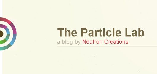
I am amazed at the typography in the heading, it is very big! but that's the hallmark of this blog. The combination of calm and cheerful colors produced a comfortable design in perspective. They also have a distinct sense of humor by making a moving circle in the header (not flash).
Thomas Maier
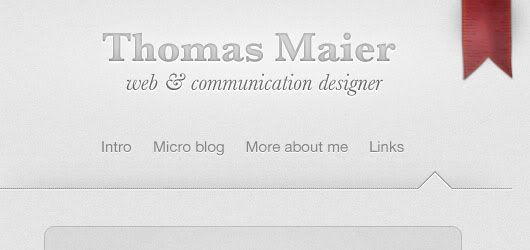
Maximum simplicity. That first impression I have gained. The most prominent graphic
elements exist only in a red ribbon on the top right. Moreover, the functions are
preferred. What makes me a bit confused is the purpose of the arrow next to the menu links. Perhaps anyone here could speculate? please comment. :D
Trent Walton

Once again an example from a combination of simple layout and a powerful visualization will result in a powerful design. Header image used is the main posts, so every time there's a new post, then the header will come change. Good idea!
Veerle Duoh
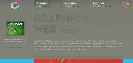
I love the detailed texture in the background of this blog, almost invisible but we can feel it. Color combination of this blog is also unique, quite feminine but not too, fitting! Layout setting mode is also unlike most blogs, we can dig a lot from this blog.
Working Library
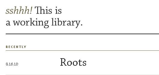
Maybe for some people, the appearance of this blog will be considered boring. Maybe because it was too simple? But certainly in terms of functionality, the design of this type is very good, heading a large, assisted with a little description about the post. I feel like reading a book.
Infomation Architects
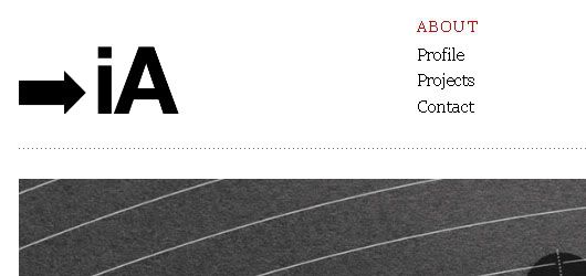
Same as Trent Walton's blog, this type is very simple. Emphasizes content rather than visual. Font settings on heading and body text setted very well, it makes this blog comfortably read for long periods.
So what do you think about these blogs? Do you have a favorite blog you want to add? please share :D

7 Comments
It was my pleasure. Thanks for your feedback!
ReplyAnd what I'm trying to mention at the last part (Infomation Architects Blog)is, an example from a blog which using combination of simple layout and a powerful visualization, it maximize the contents rather than design.
yup same here, i do that too alot
Replycheers
Thankyou very much, I hope you get inspired and keep on writing
Reply@computer services Florida
Replyyup,almost all of the above example uses a simple layout, which is good. And thanks for the compliment, even though my blog is far from perfect:D
@Tampa Personal Injury Lawyer
I like your preferred colours and design, it nice! :) keep it up
Great post! I also love blogging an I believe that a good blog design is a very important factor that could affect the number of visitors that would read your blog. Having a presentable blog design will definitely increase number of visitors. I like your designs, very simple yet unique and eye catchy. Thanks!
ReplyGood post! You have fantastic designs here! Thanks a lot for sharing these blog designs. I love your designs because they are just simple yet very attractive! Thanks for sharing!..
Replyi like this
Replywww.google.com