
Design and comfort in usage has many benefits and too many obstacles in its application. One solution is to not see the appearance of the art, so throw away the notion of blogs.
One way to detect the real issue is very simple, namely by trying again and again. Both tried their own or from friends opinion. One of the keys to create a blog that is easily enjoyed performing simple and not too experimented with the function. Here are some notes from the browsing experience of millions of pages:
1. Logos & Titles
Make sure your blog has a blog as a logo or title branding requirements. Besides important as the identity, this element is also an important element of navigation. Internet users are generally familiar with the logo or title of the blog that leads back to the front page.
2. Navigation
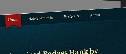
To facilitate the search for specific content, navigation is the main target of the explorers. Because here the entire site be separated according to particular categories to make it easier to navigate. Placement of navigation in general is located at the top or side, and easily visible with a series of choices. Because blogs are generally serves as a journal publication, in addition to the category, also can use the tag or archive as a means of navigation.
3. Search Bar
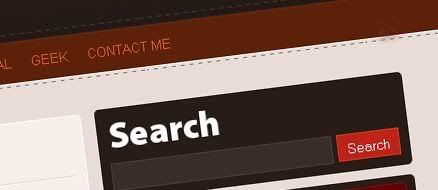
This feature is already included the main prerequisite, especially large-scale sites with thousands or millions of pages. Placement of a contact search bar or search in general parallel to the navigation and logo.
4. Consistency

Appearance of the site should have something in common between pages so easy to follow. It also allows users to identify the main content and browse the other pages. That the purpose of appearances can include color and placement of essential elements.
5. Color & Contrast
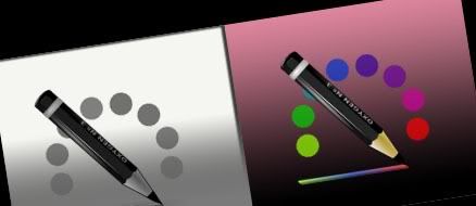
Many people are looking at the color of the art, which ended with errors. Color choices are not appropriate or even make the reading difficult texts can be fatal. When confused with color selection, just use black and white contrast of choice, or even as a variation of gray. Contrast also determine the weight of the more important elements and draw the reader's attention.
6. Text & Paragraphs
The most common mistake is to use text that is too small and tall lines (line height) that is too narrow, so that each paragraph seems crowded. Another thing to note is the comparative size of the text paragraph with the title (heading). Another is the use of additional letters of different shapes, between the text and title, to be more variable.
7. Link

The most frequent mistake is to eliminate the bottom line on every link, without adding other changes so easily distinguished. Users already familiar from the early use of the Internet, that links are always underlined. Therefore, if you want to change the variation of the link, make sure that can still be distinguished from normal text. Such as by changing color.
8. White Space

The use of white space, or blank space, useful to help readers focus on the main dish, also separate the elements, for some reason or indeed should be prioritized separately. Use appropriate blank space also helps the reader to enjoy the page roomy.
9. Widget Usage

Do you have sort of useful widget? Many bloggers use a lot widgetyang finally even make page packed. It would be better if we tried, one by one, what is not useful widgets and eliminate them.
10. Loading Time

Hosting may be a cheap source of not slow to serve visitors. Most visitors can not stand waiting for the presentation of pages that are slow, and even tends to close the page immediately.
got something to add, anyone? :)

4 Comments
Hey, How are you, my friend? I am rather busy this period, so update my blog quite slow.haha...but, when have free times, I still come and visit your content. This 10 tips are really nice. Thanks for your sharing and wish you have a nice day!Cheers :)
Replymust be pretty busy down there :D like i do lol
Replycheers
Nice blog, just kind of wandered in here but great info, maybe check out mine when you get a chance I'd love to exchange links with you if you're interested. But either way nice blog!
ReplyHmmm this is nice tips ! The problem is, I really love playing with colorful colors.. even with text. Recently it becomes trouble for me when I want to change background color! I can't find match color except white T_T If only I noticed it before...
ReplyAnyway, thx for passing by my blog :)