
I'm sure most of us have a Twitter account, but some are still using the standard background designs from Twitter.
The background is an effective field to promote your Blog (other than an update tweets).

Knowing the Twitter background size
Lets look at this Twitter background. White field in the middle (content area width 764 pixels) will always remain in the middle and large white regardless of monitor resolution that we use. And because it's been a lot of users who are using widescreen monitors, so then there will be an empty space (a total of 250-300 pixels) on the left and right.
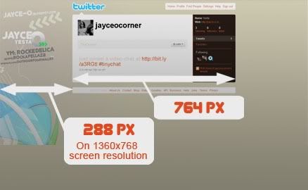
Way the background work
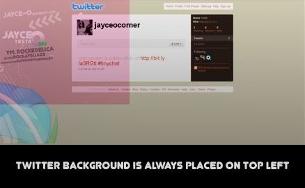
If we use our own design, Twitter will automatically put our designs start from the top left corner. So that will have leftover space that can not be covered by our designs. The solution: we can equate our design background color with the Twitter's background color than we can arrange ourself in "Settings" menu.
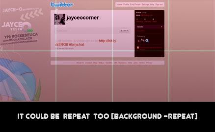
The second solution is to use a background that can be repeated (repeated pattern). It will be fine at any monitor resolution. But the bad side is, it will be difficult to put additional info on the pattern, because it will look odd if "our web address shown repeatedly.
The ideal size
Monitor with 1024 x 768 pixel resolution has become a standard . But many are also using higher resolution, just for your info, I'm using a widescreen 1360 x 768 Pixels.
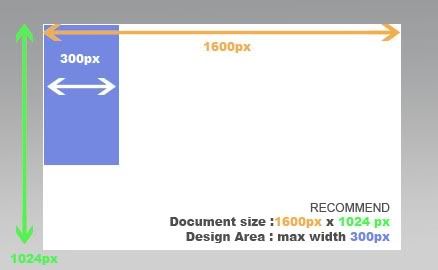
Diversity of the current monitor size, requires us to design with larger size, namely the document width and height of 1600 Pixels 1024 Pixels, then you will have a comfortable Twitter background seen until 1600 widescreen resolution, if there is still remaining space that can not be closed, we can use a trick :by equating the background color (a fade-out impression on a certain field).
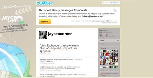
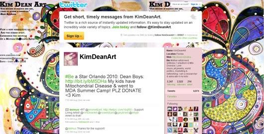
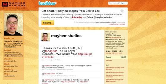
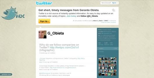
Here are some examples of Twitter background design that can inspire you to design your own background. Enjoy
Jayce-o Corner
KimDeanArt
Mayhemstudios
Ithinkmedia

G_obieta
So Which is better? using a pattern or ideal size (large) as the above?
It all depends on your need, if you need to display certain information, the best solution is by using the ideal size background. But if you do not need to display any info, you can use a pattern for best results at any resolution monitor.
there is no limit, use your own creativity as much as possible! :)

9 Comments
Thanks for the follow. I'm returning the favor. I'll come back to visit when I have more time!
ReplyYou're welcome Beth
ReplyI do too, I'll be back to visit you to find some inspiration on your new post. and thanks for U'r feedback
Kindly Regards
Yesta
Hi!! Thanks for following!! What a great blog you have here!!! I'm so thankful for the tips!!! Have a great day! :)
ReplyHi there, thanks for compliment
ReplyI currently enjoying your Cupcakes Blog too! ;)
thanks and have a good one!
Hey, Jayce, How are you? This is a nice tutorial. Thanks for sharing!
ReplyWow, your blog design changed. It looks so great! I like it! haha...
Have a nice day! :)
Pretty good! Hows you?
ReplyWell, I've changed the design because wasn't too comfortable with the previous one, thanks for the credit ;)
have a nice day!
I'm gonna try this..thanks for sharing your knowledge!!
Replyyou're welcome
Replygood luck
Now I'm using a default twitter background but I'll try to do one following your tutorial.
ReplyThank you for sharing.