
Color is a vital point in the world of graphic design. Graphic designers required to be more creative in using color. Therefore, in studying the theory of color and things that can help improve the creation of graphic designers, working with the colors seemed to be an inevitable necessity.
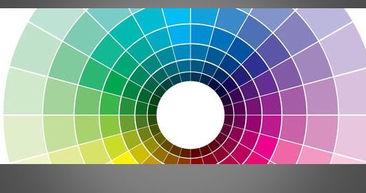
1. Color Wheel
Color Wheel is the basic theory of color represented in a circle(wheel). Consists of three basic colors (red, blue and yellow). The combination of the three basic colors generated new colors which is secondary colors. Secondary color comprised of Orange, Purple and Green. Again, the combination of a secondary color with a primary color (primary) generated other colors (tertiary color). Consisting of tertiary colors: yellow-orange, yellow-green, blue-green, blue, purple, red-purple, and red-orange. The colors are then represented by a circle of color that we know today in terms of Color Wheel.
Here are some basic rules related to color wheel:
Monochromatic Color
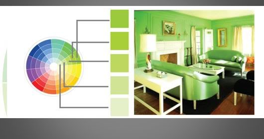
Monochromatic Color is a mix of several colors that come from one color with different values and intensities. Example: When Green color combined with another green color (with a different value and intensity) would create a harmonious blend and create a unified in whole design.
Analogous colors
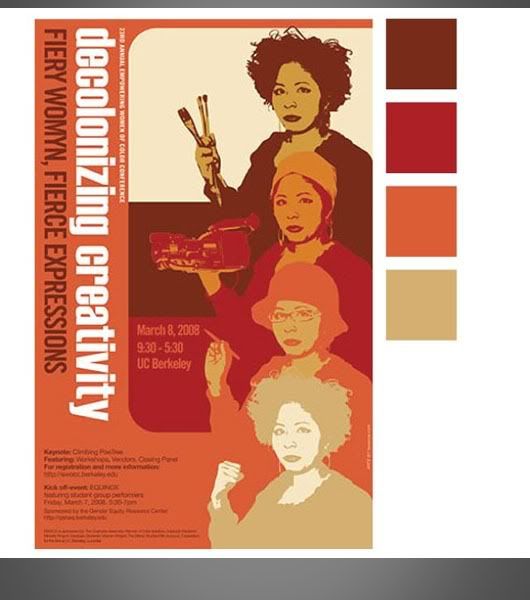
Analogous color is a combination of colors nearby. For example: the red color will match the orange, and orange will be harmonious with the yellow. Likewise, if the yellow combined with green or blue when paired with purple, and purple when combined with pink.
Complementary colors
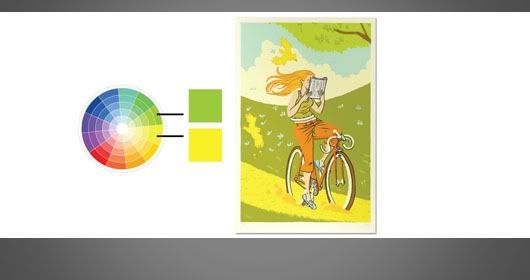
Some designs need a contrast value that is sufficient to attract more attention from the reader visually. And for that, we can use a combination of complementary colors. For example: blue and orange, red and green, etc.
Triads
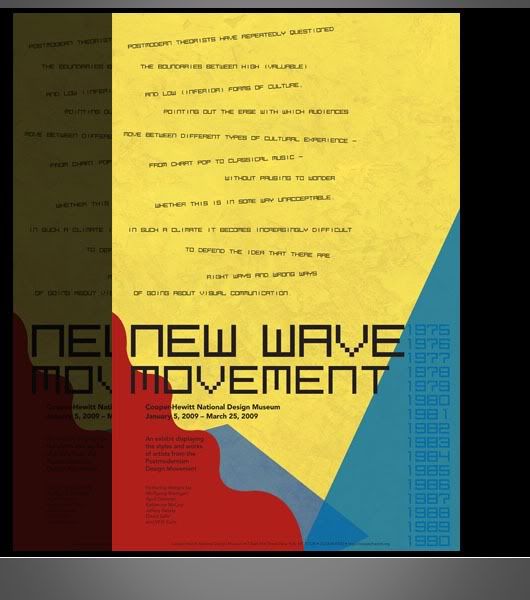
The previous color wheel theory explainins about how the basic colors to generate a variety of new color around it. It can be quite powerful if we want to mess with a variety of different colors. There are so many color combinations other than the basic colors to create a unique and different from usual design looks . Example: Melting yellow and orange, orange and red, red and pink (pink), pink and blue, and so on.
2. Space
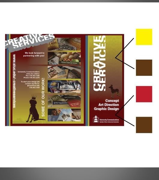
Color can be affected as well as space and shape also influence the impression conveyed in color. For example, try to add the same color in to two different forms e.g circles and lines. In a circle form, the color would appear brighter but in the line form would look darker. This is due to a large space on the circle wider than the line, so that the eye captures a vast space with the assumption that bright, even color given is the same color. This is the instinctive response from human eyes responding to an impression on a visual.

3. Contrast
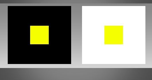
The contrast in color can be affected by other colors around it. The theory is simple: The contrast is the result of the Dark VS Light.As an example, put a small square of yellow on a black background, the contrast value increases and a yellow square will be easily visible. Conversely, replace the background with white color, the contrast value will decline and the square will be difficult to see.
4. Color Psychology
Colors can represent the characters and certain feelings. For example, red for the impression of an aggressive, passionate, hot and fast. Black gives mystery, dark, and sophisticated impression . By studying the psychology of color, we can customize a design with the intended target, an effective visual communication, and build a unified visual sense to the reader.
5. Color Field
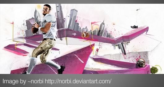
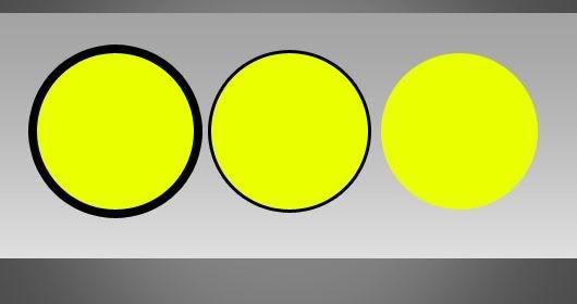
Outside line on a field can serve as a constraint, so that the color so as not to be seen to spread out the field. The more thin the outline, the more spread out areas of color to the area. Conversely, the thick outline, then the colors will be looks more assertive.

16 Comments
the yellow illusions are fascinating!!
ReplyAnd with the wrong combination of colors..design can be so poor and bad!
ReplyLove your blog,always containing great info Yesta:)
The color theory is amazing.... got color sense !!
ReplyWow! The way how you explain the 3 colors is really interested thanks for this post.
ReplyThanks for all your positive feedback, guys! I had a blast collecting this info, nice to see it getting some love.
ReplyI just stumbled on your blog when I was lookng on google. I have to say that the information here was the most complete that I found anywhere. I am definitely bookmarking this to come back and read later.
Replythanks! And I'm glad you like it
Replycheers
It was my pleasure :)
Replyشكرا على الموضوع وتقبل مروري
Replythanks
I just stumbled on your blog when I was looking on google. I have to say that the information here was the most complete that I found anywhere, i am definitely bookmarking this to come back and read later, informative and valuable information, if you have a time feel free to drop by in my story too. Have a great day!
ReplyThis is a great article. Like somebody said above you should be careful about choosing the colors because if you choose them wrong you can ruin all your work.
ReplyThanks for sharing those great tips.
In graphic designing the color combination is very important so this theory is very important for graphic designer.
ReplyHey nice admin, this awesome topic hasn't been much discussed on the entire internet, information topic about 5 Important Points to Know About Color Theory made my knowledge raising, always keep spirit and create a new article and i already bookmarked it. Regards
ReplyInteresting debate on a subject most of us take for granted. Thanks
Replyi was doing a word cloud and had a big doubt on how people combine colors to make it a visual treat just then i found your blog explaining about colors and their meaning.Wow! Just luv it and greatly appreciate your attitude and good heart to share the info :-):-)
ReplyVery clearly and easy to understand. Thanks so much :)
Reply