One of the most important basic principles of graphic design is the contrast. Contrast serves to identify the message and create a focus. Thus, in a hierarchical guided the audience to digest the information and messages as expected. Regardless of the role of contrast in terms of function, the contrast is also able to increase the aesthetic value if used appropriately.
A simple example of how the role of contrast can be seen from the existing billboard alongside a road. Audience (which is the road users) are too busy. They only had a few seconds just to see and understand the contents of the message. If within the duration that a design is not capable of transferring information, then once the design has failed anyway.
People ignore design that ignores people
— Frank Chimero
Creating contrast in your Design
Basically, the principle of contrast is quite simple, namely the difference. Contrast would present itself if we make a distinction between elements with one another. Here is some form of contrast that is commonly used by graphic designers in a work or project:
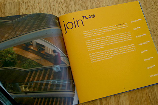
1. Size
Determining large or small forms are most commonly used ways to create contrast. Instinctively, our eyes are quicker in capturing a larger element size. An example is the design below, the level of contrast between the title and body text is very high. Such differentiation is in addition to inviting the attention it also contains its own aesthetic values.
2. Color

The following logos are visualizing depth by making the contrast between colors. Therefore, we can see that as if, fingers arranged from closest to farthest. Yet this is just a simple 2-dimensional design using two colors.
3. Texture
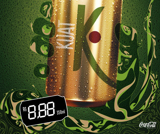
The following advertising poster depicts a hand holding a canned beverage. Despite the hand and the background color is almost the same, but differences remain visible. Here is used the principle that refers to the texture contrast. Hands with water texture can be easily distinguished from the textured grains of water background.
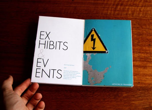
4. Position
An element is out of line (or an order) will look striking and different that it would create a contrast. The layout of the brochure below is a simple example of how the title is very interesting because it's located in a different position to other content.
5. Shape

The logo below is very clever, simple and focused. This logo illustrates the droplets of oil spills. Despite having a similar color to the typeface used, we can easily catch the oil droplets is due to differences in shape.
6. Movement

Just need a few seconds for anyone to be able to understand the message and visual identity that protrudes from the logo 'Killed Productions' below. The letter 'i' which has the same shape and color with other letters still attract attention due to the different movement directions.
Conclusion
Contrast plays an important role in graphic design, regardless of its form. The success of a design strongly influenced by how the use of contrast in it. Another example I can describe is how the contrast on the 'Add to Cart' at the online stores can effect the level of sales.
What do you think? Please share via the comments! :)
1 Comments:
I really enjoyed this post. Such great information with awesome examples. It will be so helpful for everybody from this business of graphic design.
Reply